Defeating IE5 CSS bugs with the help of jwz
20th May 2003
Today’s CSS case study will be Jamie Zawinski’s LiveJournal. OK, I admit that he’s something of a tempting target after his widely publicised CSS rant last month (which was the main inspiration for this course), but there are a number of sensible reasons his site makes a good case study as well. The theme for today is “bugs in IE5 for Windows”, and jwz’s site offers two classic examples that fit this theme nicely. The first is the fact that the design is centered on the page, and the second is his choice of Verdana, a font which requires some trickery to get working well in IE5. In addition, the design of the entries seems to be a natural fit for a table based layout, so demonstrating how much simpler the code can be in CSS will hopefully turn a few heads.
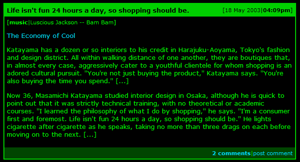
Here’s the “before” screenshot:
And here’s the original HTML (I’ve added some newlines but other than that it’s as seen on the page):
<table summary="" border="0" cellpadding="2" class="entrybox" width="600"
cellspacing="0">
<tr align="left">
<td align="center" bgcolor="#00CC00">
<table summary="" border="0" cellpadding="5" width="100%" cellspacing="0">
<tr align="left">
<td class="caption">Life isn't fun 24 hours a day, so shopping should be.</td>
<td class="index" align="right">[18 May 2003|<b>04:09pm</b>]</td>
</tr>
<tr align="left">
<td bgcolor="#000000" colspan="2">
<table summary="" border="0" cellpadding="0" cellspacing="0">
<tr>
<td class="meta">[</td>
<td class="meta" align="right"><b>music</b></td>
<td class="meta" align="center">|</td>
<td class="meta">Luscious Jackson -- Bam Bam</td>
<td class="meta">]</td>
</tr>
</table><p>
<p><a href="
http://www.nytimes.com/2003/05/18/magazine/18TOKYO.html?8hpib=&pagewanted=all">
The Economy of Cool</a> <p> Katayama has a dozen or so interiors to his credit in
Harajuku-Aoyama, Tokyo's fashion and design district. All within walking distance
of one another, they are boutiques that, in almost every case, aggressively cater
to a youthful clientele for whom shopping is an adored cultural pursuit. ''You're
not just buying the product,'' Katayama says. ''You're also buying the time you
spend.'' [...] <p> Now 36, Masamichi Katayama studied interior design in Osaka,
although he is quick to point out that it was strictly technical training, with
no theoretical or academic courses. ''I learned the philosophy of what I do by
shopping,'' he says. ''I'm a consumer first and foremost. Life isn't fun 24 hours
a day, so shopping should be.'' He lights cigarette after cigarette as he speaks,
taking no more than three drags on each before moving on to the next. [...] <p>
</td>
</tr>
<tr>
<td class="comments" width="100%" align="right" bgcolor="#004400" colspan="2">
<a href="http://www.livejournal.com/~jwz/203141.html"><b>2 comments</b></a>|
<a href="http://www.livejournal.com/~jwz/203141.html?mode=reply">post comment</a>
</td>
</tr>
</table>
</td>
</tr>
</table>
That’s three tables for every entry on the page. If we trim it down to basic structural HTML, we get the following:
<div class="entry">
<p class="date">[18 May 2003|<strong>04:09pm</strong>]</p>
<h2>Life isn't fun 24 hours a day, so shopping should be.</h2>
<p class="music">[<strong>music</strong>|Luscious Jackson -- Bam Bam]
<p><a href="
http://www.nytimes.com/2003/05/18/magazine/18TOKYO.html?8hpib=&pagewanted=all">
The Economy of Cool</a></p>
<p>Katayama has a dozen or so interiors to his credit in Harajuku-Aoyama,
Tokyo's fashion and design district. All within walking distance of one
another, they are boutiques that, in almost every case, aggressively
cater to a youthful clientele for whom shopping is an adored cultural
pursuit. ''You're not just buying the product,'' Katayama says.
''You're also buying the time you spend.'' [...] </p>
<p>Now 36, Masamichi Katayama studied interior design in Osaka, although he is
quick to point out that it was strictly technical training, with no
theoretical or academic courses. ''I learned the philosophy of what I
do by shopping,'' he says. ''I'm a consumer first and foremost. Life
isn't fun 24 hours a day, so shopping should be.'' He lights cigarette
after cigarette as he speaks, taking no more than three drags on each
before moving on to the next. [...] </p>
<p class="comments">
<a href="http://www.livejournal.com/%7Ejwz/203141.html" class="count">2 comments</a>
|<a href="http://www.livejournal.com/%7Ejwz/203141.html?mode=reply">post comment</a>
</p>
</div>
That’s quite a substantial reduction in markup. Here’s what it looks like. The challenge now is to make it look like it does in the picture.
First, let’s set a few basic rules. JWZ’s site has green text on a black background, both of which should be set as rules on the document body (they could be set on individual elements but since they apply to the whole document it’s best to define them higher up):
body {
  background-color: #000;
  color: #0f0;
}
Note that while the original site uses #000000 and #00FF00 as hexadecimal colour attributes on the body tag, I have used #000 and
#0f0. Since many common colours can be represented using three pairs of hexadecimal digits, CSS allows you to use three instead of six and will “double” each digit in its place. color: #00ff00; would have exactly the same effect.
Setting the font size (IE bug #1)
Now it’s time to tackle our first IE5/Windows specific bug. Verdana is an extremely popular font among web designers, but suffers from the unfortunate problem that it is sinfully ugly when displayed at the browser’s default text size. Knock it down just one size and it becomes a great deal pretty, while remaining completely readable. As a result, if we want to use Verdana we really need to make it smaller.
CSS provides a truly huge range of font sizing options, and each and every one of them carries its own set of flaws and limitations thanks to differences in implementation between the many CSS supporting browsers. A good resource for understanding the scope of this problem is Owen Brigg’s excellent Text Sizing article, which includes 274 screenshots of different font sizing techniques in different environments. To cut a long story short, the only reliable cross browser sizing method is to specify the size of the font in pixels. This comes with one massive drawback: doing so will prevent IE users from resizing the text in their browsers. If you care at all about accessibility you’ll know why this is a bad idea.
No matter which font sizing technique you use, it is widely recognised that the best way of dealing with font sizes is to set a single basic font size on the body and then size other text on the page relative to that initial size using ems (described briefly last tutorial) or percentages. Personally, I like to use a font such as Georgia which looks good at the default browser size setting and avoid the whole issue of setting an initial size, but as we have already discussed if you are using Verdana this is pretty much out of the question. When forced to resize the default font, my favoured method is to use the font-size keywords small and x-small.
This is where the IE5 bug comes in. Most browsers (including IE6 in standards mode, all Gecko engine browsers and Opera 7) display Verdana at the size I prefer if you specify font-size: small. IE5 for Windows on the other hand requires font-size: x-small. Since IE5 still has a relatively large market share, it’s important to get things looking good in that browser, no matter how irritating it’s support of CSS. It’s time to apply a hack...
Hacks are something of a controversial issue within the CSS community. Some people see them as an anathema to everything that CSS is meant to represent, while others (myself included) see them as a slightly unpleasant tool that can help achieve a practical end. Since the focus of this tutorial is on the practical applications of CSS, I’ll leave discussions of the validity of hacks to the css-discuss wiki.
The hack I shall be using here is the famous Box Model Hack by Tantek Celik. Originally devised to get around a serious flaw in IE’s implementation of the box model (to be covered later in the course), the box model hack allows a CSS author to feed one value to IE5 and another to better, more standards compliant browsers. We want to give IE5 x-small and everything else small, and here’s the code we are going to use:
body {
  background-color: #000;
  color: #0f0;
  font-family: verdana, sans-serif;
  font-size: x-small;
  voice-family: "\"}\"";
  voice-family: inherit;
  font-size: small;
}
html>body {
  font-size: small;
}
Ugly, isn’t it? The way it works is explained elsewhere, but believe it or not the above code will kick IE5 in to line with the rest of the mainstream browsing world. Here’s how it looks. Let’s move on.
Styling the Entry
Now that text sizing is out of the way, we can get on with styling the entry itself. First, let’s look at the div surrounding each entry. Firstly, it needs to be 600 pixels wide to match the width of the table in the original. The original design has a 2 pixel wide line around the edge of the table, and we can replicate this using a CSS border. Borders in CSS can be applied to the top, left, right and/or bottom of an element in any colour, any thickness and a number of different styles: they are a very powerful tool. In this case we just need a 2 pixel wide green border around the whole div. Here’s the CSS:
div.entry {
  width: 600px;
  border: 2px solid #0c0; /* Applied all the way around the div */
}
The entry title is a critical part of the design. We have used an h2, but we need to style this with a green background and correctly sized black text. Headers always come with a default margin above and below the header, but since we are using the background colour of the element as part of the design we need to eliminate this by specifically setting the margins around the element to 0. We also need some padding to give the text inside the element some space—trial and error leads us to set this at 5 pixels:
h2 {
  margin: 0;
  padding: 5px;
  font-size: 1em;
  color: #000;
  background-color: #0c0;
}
The date for each entry appears alongside the title, on the right hand side. As we saw last time, this can be achieved with a float. I’ll also set the font size to 0.85em (again found using trial and error) and add some padding to ensure the date appears inline with the heading:
div.entry p.date {
  font-size: 0.85em;
  float: right;
  color: #000;
  background-color: #0c0
  margin: 0;
  padding-top: 5px;
  padding-right: 5px;
}
I’ve specified the background-color again because it is good practise to always set a background colour at the same time as you set the colour of an element. This helps ensure you never accidentally end up with unreadable text that is the same colour as its background.
Here’s what our redesign looks like now.
Tidying up the text
There are two glaring problems with what we now have. Firstly, there is no space between the borders and the text. Secondly, the link colours aren’t as they should be. We can lift the link colours straight from the attributefs on the body tag in the original site:
a:link {
  color: #00DDFF;
  text-decoration: none;
}
a:visited {
  color: #FF6633;
}
We are using a:link as the selector rather than just a on its own, because a will match all <a> elements including those that are just being used as a link target. There aren’t any on the page, but it’s a good idea to get in to the practise of using a:link to style links anyway. a:visited applies styles to visited links. The :something syntax is called a pseudo-selector. It’s also worth noting an accessibility point here: it’s generally a very bad idea to set links apart from normal text by colour alone, so text-decoration: none should be discouraged unless some other non-colour based visual indicator is also specified. I’m ignoring that for this example in order to comply with the original design.
Space between the border and the text can be added in a number of ways: as padding within the entry, as a margin on the paragraphs or as padding on the paragraphs. Since we have set a width on the entry it’s a good idea to avoid adding padding to this as this can result in IE5 misbehaving (a box model problem, which could be solved by the box model hack but why hack when you can possibly avoid it?). Instead we will set a margin on the paragraphs:
div.entry p {
  margin: 1em 5px;
}
Here we are using another CSS shorthand. Both padding and margin properties can be set with one, two, three or four properties. If only one is provided, it is applied to all four sides. If two are provided (as in this example) the first is applied to top and bottom and the second to left and right. If four are provided, they apply to Top, Right, Bottom, Left respectively (a good mnemonic for this is TRouBLe, which I picked up from Eric Meyer). Behaviour for three properties is defined but it’s quite complicated so I recommend avoiding it entirely. The upshot of all this is that the above rule adds a 1em margin to the top and bottom of each paragraph and 5 pixels to either side. You’d be forgiven for thinking that this means margins would be spaced 2 ems apart, but in fact the margins on elements on top of each other collapse to fill the space of just one. I’ll talk about this more when I cover the box model in detail.
The styles for the comments section at the bottom (complete with dark green background) and the music section at the top of the entry should be pretty self explanatory, so I’ll provide them here without further analysis:
div.entry p.comments {
  background-color: #040;
  margin: 0;
  padding: 5px;
  text-align: right;
  font-size: 0.85em;
}
p.comments a.count {
  font-weight: bold;
}
div.entry p.music {
  font-size: 0.85em;
  margin-top: 0.5em;
}
Note that both paragraphs have a margin explicitly set—this is important as we need to over-ride the margin set on all paragraphs within div.entry earlier on. This is also related to the reason the full div.entry p.comments selector is used instead of just p.comments—if you want to know the full reason for this, look up the CSS specificity rules which are outside the scope of this article.
Centering the DIV
We’re nearly there! All that remains is to center the div on the page. This is the point where our second IE5/Windows bug rears it’s ugly head...
The standard way of centering a block level element (for example a div or a paragraph) in CSS is to set the left and right margins of the paragraph to “auto”. This can be achieved using the shorthand property explained above: margin: 0 auto;. Were it not for IE5, our troubles would be over. Unfortunately, IE5 fails to recognise this method.
As luck would have it, we can now use another IE5 bug to our advantage. The text-align: center declaration, as you might expect, aligns text in the center of the element. IE5 incorrectly also applies the property to block level elements, which include our troublesome div. So we can set text-align: center on our body element and all is well...?
Not quite. Like most text properties (such as the font-size property we were playing with earlier) text-align is inherited. If we center the text in our body, we end up centering it in all of our other elements as well. Luckily we can use text-align: left on the other elements in our document to prevent this from happening. Combine these three CSS tricks and you get the following method for centering elements in an IE5 friendly way:
body {
  ...
  text-align: center;
}
div.entry {
  ...
  margin: 0 auto;
}
body div, body p, body h2 {
  text-align: left;
}
Which brings us to our final result: JWZ’s blog entries in pure CSS. It took quite a bit of work, but I think the results speak for themselves.
What you should have learned
While most designs can be achieved in CSS, some are harder than others. This is not the fault of CSS; it is more a problem with faulty browser implementations of CSS. When people call IE5/Windows the “new Netscape 4”, they are doing so with good reason! However, IE5’s deficiencies are well understood with the CSS community and workarounds exist which, while initially tricky, for the most part work very well. With a bit of insider knowledge the beast can be tamed.
In this tutorial I’ve tried to roll up my sleeves and get stuck in to the dirtier side of CSS development. I’ve demonstrated some hacks, and I’ve shown how there can be more to practical CSS than meets the eye. It may seem like an awful lot of work, but in fact the initial jwz remake took me just over half an hour thanks to my previous experience with IE5 bugs.
For the next installment, I will be stepping back from hacks and unpleasantries and looking at CSS being used in a much simpler light: to visually enhance semantically structured page elements. I also have another case study planned which will make much lighter reading than this one. As always, comments are welcome.
And finally, apologies to jwz for borrowing without asking. I hope I haven’t caused offence.
More recent articles
- Weeknotes: Llama 3, AI for Data Journalism, llm-evals and datasette-secrets - 23rd April 2024
- Options for accessing Llama 3 from the terminal using LLM - 22nd April 2024
- AI for Data Journalism: demonstrating what we can do with this stuff right now - 17th April 2024
- Three major LLM releases in 24 hours (plus weeknotes) - 10th April 2024
- Building files-to-prompt entirely using Claude 3 Opus - 8th April 2024
- Running OCR against PDFs and images directly in your browser - 30th March 2024
- llm cmd undo last git commit - a new plugin for LLM - 26th March 2024
- Building and testing C extensions for SQLite with ChatGPT Code Interpreter - 23rd March 2024
- Claude and ChatGPT for ad-hoc sidequests - 22nd March 2024
- Weeknotes: the aftermath of NICAR - 16th March 2024